UX & UI Design for
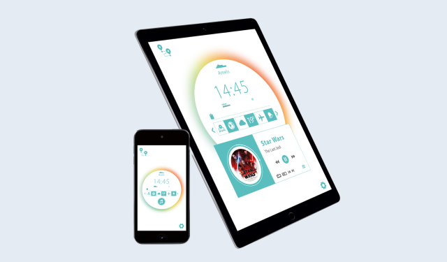
Audio and Visual Control System for Amels
The
Short
Story
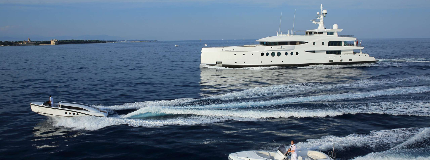
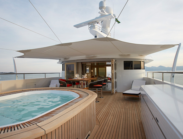
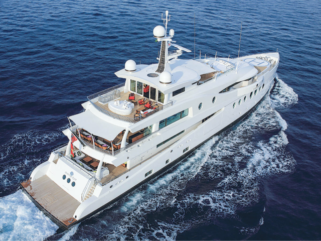
Amels Holland is one of the world’s leading global shipyards, specialising in the construction of luxury yachts. Harris Grant is a world leader in creating bespoke audiovisual entertainment, technology and communication systems.
Fiora was briefed with creating a visual interface that would integrate all the services and ambient adjustments across Amels’ yachts. Working collaboratively with the Harris Grant team, we needed to ensure that the final interface was as ‘skin-able’ as possible, allowing the overlay of new icon sets, colourways and graphics to reflect the various yacht interiors and functionality.
The
Result
The final app was proof that design thinking, a focus on user experience and the patience to test and hone functionality against user journeys, can result in an incredible interface. Using just icons, users could achieve just about any function, from ordering a mojito, booking a massage, broadcasting a football match or changing the environmental settings.
As well as the approval of our client, we also gained recognition within the technology industry. Creston, a global leader in smart home technology, awarded us their coveted Creston Award for user-interface design.
Creating the app provided us with the privileged opportunity to look at user-interfaces in a fresh and unique way. Without the use of language, we went back to the fundamentals of design, user experience and creativity, to create a truly seamless experience.
The
Long
Story
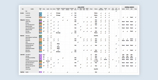
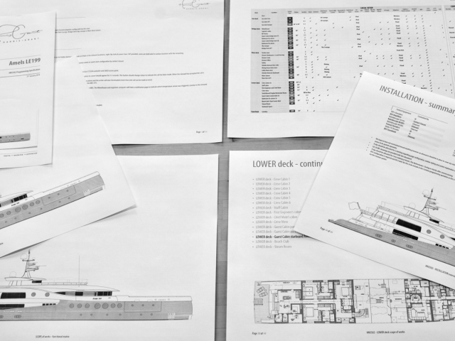
Functional scope and services matrix
The brief came with its own set of unique challenges. A key task was to remove as many written instructions and prompts in order to serve Amels’ global customer base. This required translating thousands of environmental, audio, visual, hospitality and communication services into intuitive visual cues and directions.
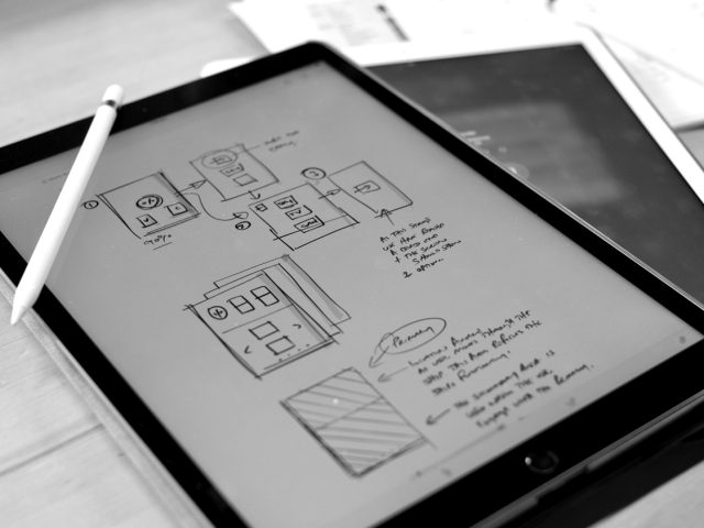
We began by creating several models mapping the stakeholders, users and technology. Using empathy and journey mapping, as well as service blueprints, we broke down the complex multi-layered user states into a mappable set of inputs and outputs. This allowed the team to plan journeys through the app, making navigation more elegant and intuitive.
Wireframing
Armed with the function scope and services matrix, the team set about exploring all the inputs and devices onboard. Each functionality was mapped to the service blueprint and applied with a different level of importance. The team were then able to map out expected user journeys, running through different scenarios to ensure they could easily reach their goals.
By breaking into smaller teams we were able to assign tasks and test each journey and solution independently. This UAT method resulted in a robust system where teams were able to share insights and discoveries, quickly negating any underlying troubleshooting issues.
With several prototypes in play, we ran multiple tests in order to create feedback loops. These were then stress-tested and shared with the crew for further feedback.
Fiora's approach has always been similar to ours; thoughtful, thorough, and creative. They have helped us to refine our positioning and message across several channels seamlessly.
NEIL GRANT | THE HARRIS GRANT GROUP

Look & feel
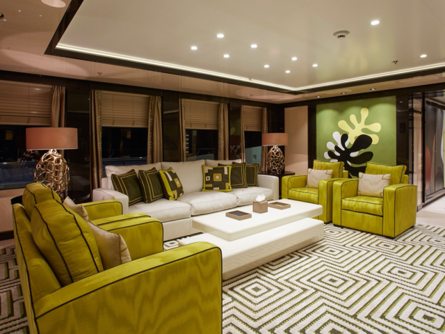
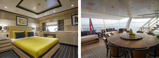
While planning the user-journey of the interface, the team began to explore its look and feel. Using mood boardst, they selected several styles that matched the tone and textures of the yacht interiors before sharing them with the yacht design team.
When developing icons, a thorough understanding of use cases is necessary. The icon team began by researching existing and approved icon sets that would be universally understood, exploring a vast array of entertainment, transportation and travel icons.
Several user journey models were created, mapping the users and their needs, against the technology and the services available at any given point across the yacht. By applying UX and icon design principles, we aimed to provide the user with the shallowest learning curve possible.
To break down the complex multi-layered commands a user may perform into a mappable set of inputs and outputs, we applied six key guiding principles:
- Clarity
- Readability
- Consistency
- Intelligence
- Personality
- Ease of use
Icon
Development
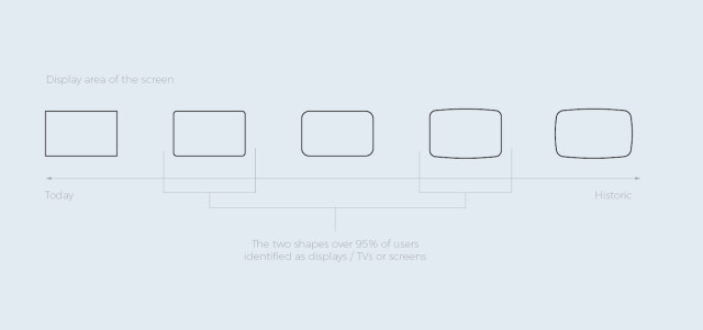
We quickly moved to the icon development stage and began testing icons against these six guiding principles. By testing the icons ethnographically, we found that unsurprisingly, age, culture, exposure and geography played a part in users’ understanding of icons and their use case. The example below highlights some of the issues the team experienced on the project. At what point is a screen a screen?
Is this universally accepted as a display? What can we remove and still continue to be a screen? What do we need to add to deepen the understanding and increase clarity?

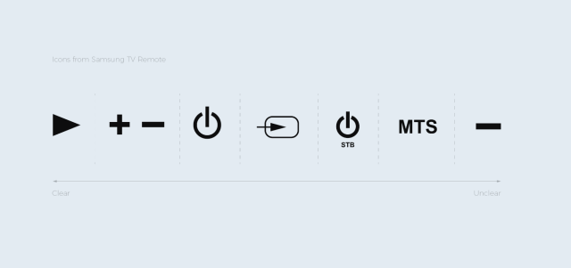
The example shown above: Samsung TV Remote.
In this example, it is clear which icons are intuitive and which ones require a manual to decipher their meaning.
As the team began to build out a deeper understanding of each icon and its functionality, it became clear that when an icon uses an unfamiliar metaphor, it’s not only hard to understand but also negatively impacts the other icons.
For example, in the image below, the icon on the far right seems to indicate a minus symbol. Most users have learnt over time that, especially when using a remote, a minus symbol indicates the lowering of something. In fact, with the same icon used on a volume button to lower the volume, it makes sense that the icon on the right would work in a similar way. However, in this case, the icon actually allows the user to add an additional channel, creating a confusing and unintuitive functionality that fails to work harmoniously with the other icons. It was important that we avoided these kinds of set-ups when creating our own icon functions.
Strategic
Ignorance
In order to flatten the learning curve for the user, we applied the principle of strategic ignorance. This involved selecting a member of Fiora who wasn’t involved in the project and having them determine which icons were clear and easily understood and which ones would require a learning curve. This practical test helped to prevent bias in the design and further hone the user journey.
Physical &
Digital Clues
With canvas sizes for icons as small as 48x48 px, it was vital that the final icons we selected were familiar with the user and had the right amount of detail to be clear.
For the user interface, a reductive style was chosen for both user clarity and the location-aware properties of the interface. With iBeacons installed across the yacht, the user interface would automatically adjust to be location-specific, so a simplified layout was necessary for functionality.
