Rebranding Clear Junction
Clear Junction is a global payments solution provider serving a wide range of financial institutions. They minimise risk to facilitate global payments between FIs, particularly those who don’t have access to traditional banks. This includes banks, payment service providers (PSPs), institutional traders, and cryptocurrency firms.
Despite their pivotal role in facilitating global payments and minimising risk, their existing branding was not conveying the right message.
Issues identified with the old branding.
- Angular and Harsh Design
- Outdated and Busy Layout
- Misaligned Imagery
- Overused stock images
- Overemphasis on Crypto
- Branding did not inspire confidence.

Original Clear Junction Logo

New Clear Junction Logo
Our objective was clear: transform Clear Junction's brand to accurately reflect their reliability and the quality of their services. We wanted to create a brand personality that was:
- Reliable and Safe
- Clean and Approachable
- Adaptable and Flexible
- User-Friendly
- Smooth and Professional

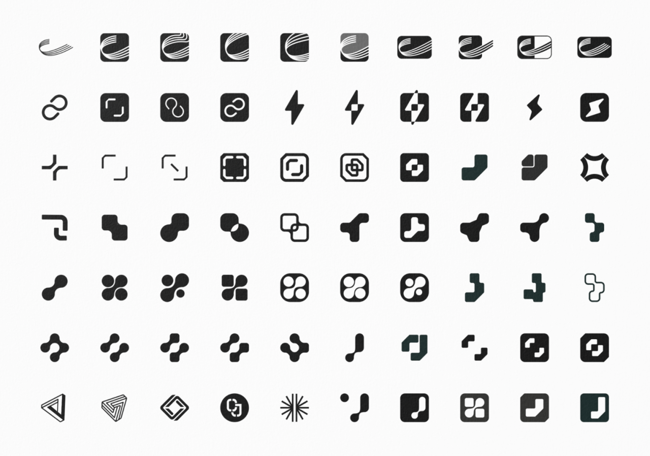
Logo exploration
A simple black and white colour scheme roots the brand in a sense of stability, trust, simplicity and honesty.


Graphic System: Grids, Modularity & Connections

Connected Shapes Animation
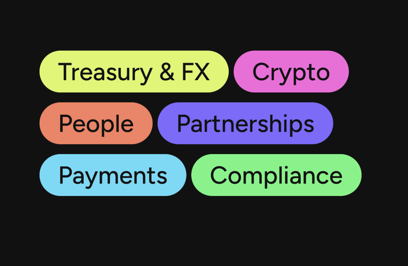
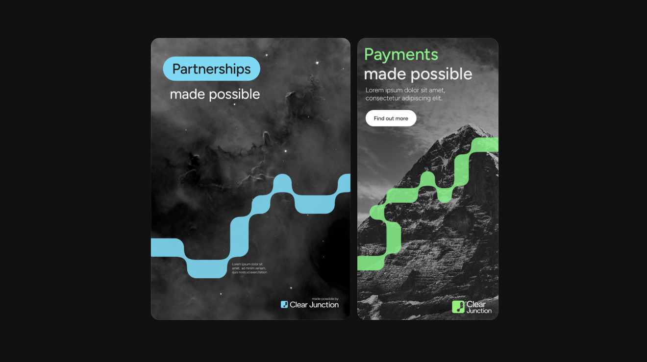
A diverse and colourful secondary palette adds energy and dynamism to the strong base of black and white. In combination with the core palette, it reflects the balance of bravery and compliance that is integral to Clear Junction. Each of the colours have been assigned to a field or sector.


Fiora helped us massively during our rebranding project, not only with their incredible knowledge on this topic but also with their very friendly approach, which definitely made this big project easier to work on. I just have to thank them for their care in delivering an incredibly beautiful new brand that covered everything we asked for during the initial conversations.
