UX Design and Build
Drives Growth for
Big Bus Tours
The
Short
Story
Big Bus Tours is one of the largest open-top bus sightseeing tours, operating in over 11 countries and 20 cities.
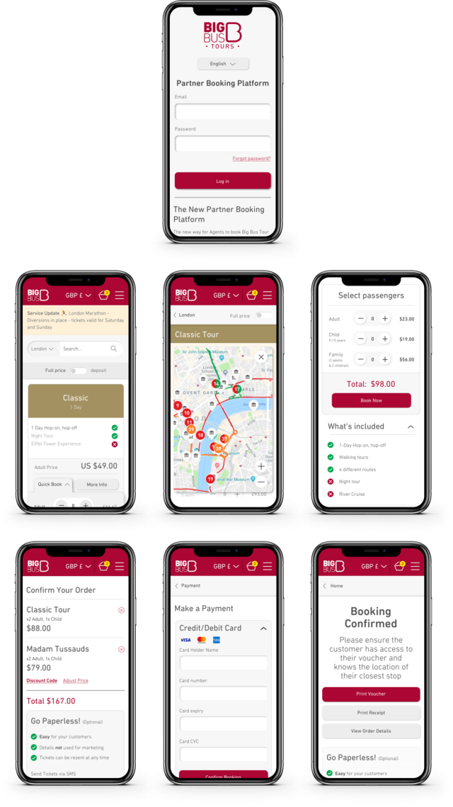
Big Bus Tours wanted to update their outdated ticketing system with a new, more intuitive approach. Fiora was tasked with designing a consumer-friendly interface that would increase ticket sales and drive more interest in their tours.
By discovering the core needs of real users, we were able to evolve an ambitious UX project into something even more dynamic.



The
Long
Story
Telephone voice and leg work
For the platform to succeed on a global level, we needed user feedback from a global team. So, we picked up the phone and hopped on trains, interviewing and shadowing dozens of agents, from hotel concierges in Dubai to street kiosk owners in London. It was through this hands-on, ethnographic approach that we discovered the features that users really needed.
Cash out, money in
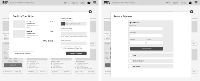
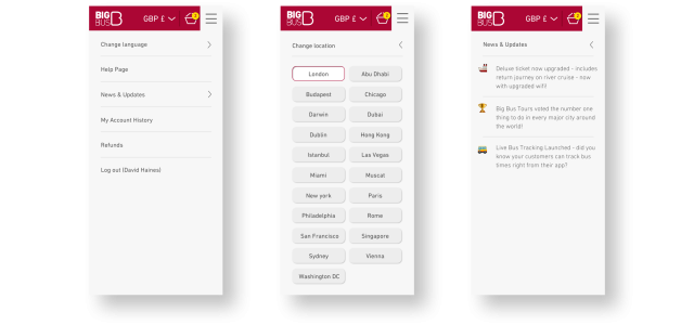
An important objective, alongside the usability of the platform, was to reduce the number of paper tickets being sold and move sales into a digital format. Many kiosk owners relied on physical tickets delivered by members of BBT’s relationship management team. The delivery could be sporadic and time-consuming, and agents would often miss out on sales due to oversale. Feedback from both BBT and agents helped inform the UX process we used to solve these issues. This included a mobile-first platform, multiple charging options, the option to change currency based on location and customer need, and the ability to automatically record commission, limiting any cash leakage.

The
Human
Element
Our experienced team of digital strategists worked hard behind the scenes to provide insightful recommendations on SEO and paid media tactics, aiming to enhance website performance and increase brand visibility through. By incorporating fresh copy and content into the site, we meticulously devised and executed a content migration strategy to preserve its search engine rankings.
Impressively, within just 24 hours of its launch, the website not only maintained its search engine rankings but also measured an organic ascent of 5 positions for its core services on Google.
Not just a pretty face
The user-feedback we gathered was translated into functional, time-saving features.One of the main challenges was ensuring these variables worked seamlessly across different devices and locations, without interfering with usability. Our commitment to creating an evidence-based, user-first platform meant that every design feature, from button placements to optional rollovers, had a use case. Each version was then rigorously tested through meetings with key BBT stakeholders and user-testing sessions with various agents.
The
Results
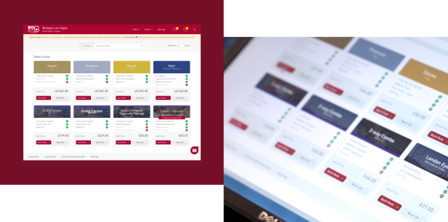
A streamlined, user-friendly platform that was as good-looking as it was functional, producing results well above their expectations. The clarity of the system enabled Big Bus Tours to onboard dozens of new cities more quickly, with less effort, and at a fraction of the cost.. Moreover, once onboard, city agents were able to easily navigate through the intuitive platform, encouraging re-use and creating a loyal customer base. This got the Big Bus Tours name out, drastically boosted ticket sales and ultimately increased profits.
