There's an inherent beauty in representing data through visual mediums. "A Sea of Thoughts" is a fascinating experiment undertaken by the team. Their objective was to harvest posts from various social media platforms worldwide, focusing specifically on iterations of the phrase "I think" expressed in a multitude of languages.
The application, would aggregate these posts into a visually appealing display allowing the users to select not only how the informations was displayed but also allowed the users to move around the data. The App worked by extracting the text from each post, while purposefully omitting any accompanying images, thereby showcasing only the message itself.

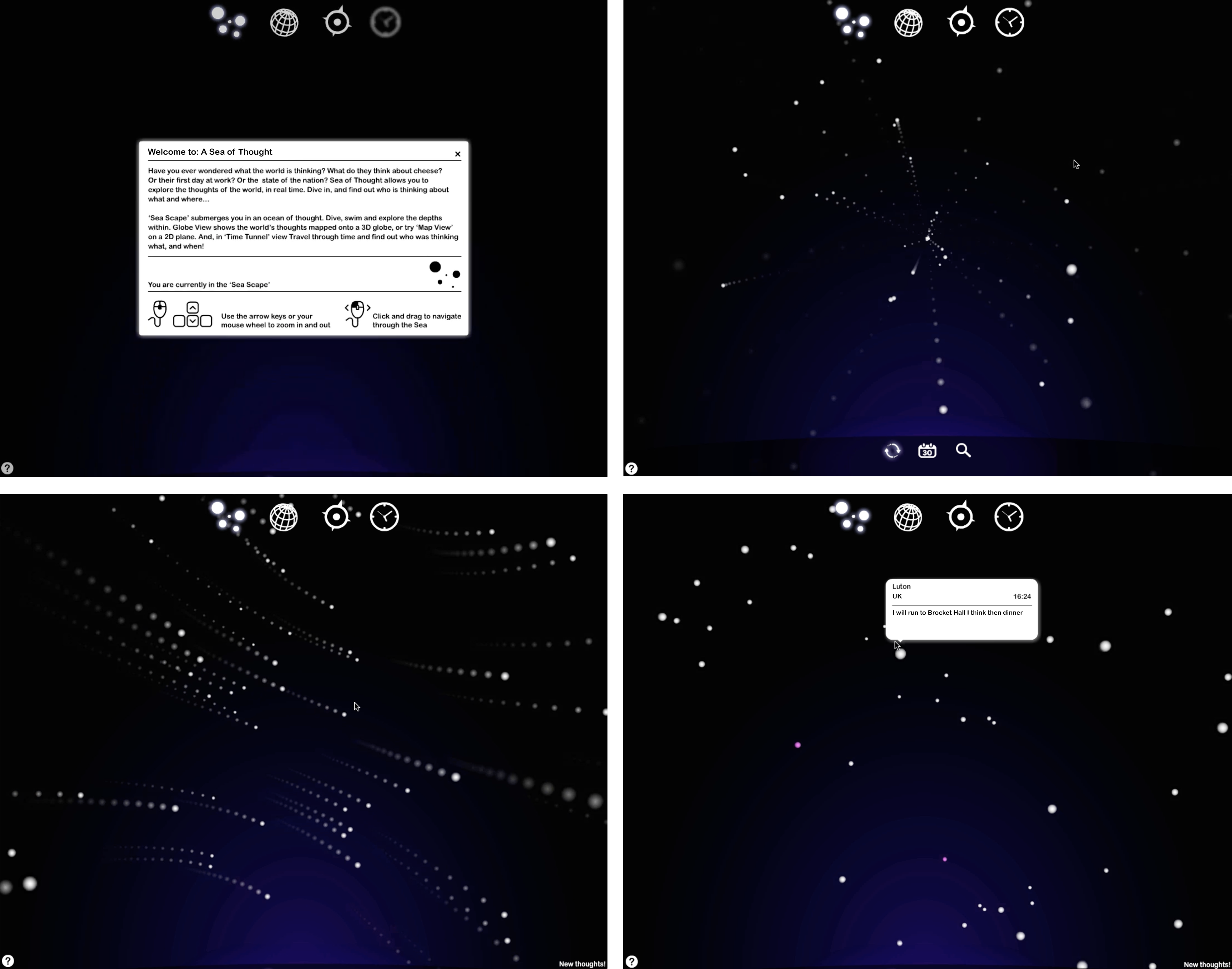
The following paragraph was the premise and introduction of the concept. Have you ever been curious about the collective thoughts of the world? Wondered what people think about topics as diverse as cheese, their first day on a new job, or the current state of their nation? "Sea of Thought" offers a unique opportunity to explore these global musings in real time. The platform lets you dive into the world's collective consciousness, providing insights into who is thinking what, and where.
The "Sea Scape" view immerses you in this vast ocean of thoughts. Here, you can dive, swim, and navigate through the rich and varied depths of global opinions and reflections.
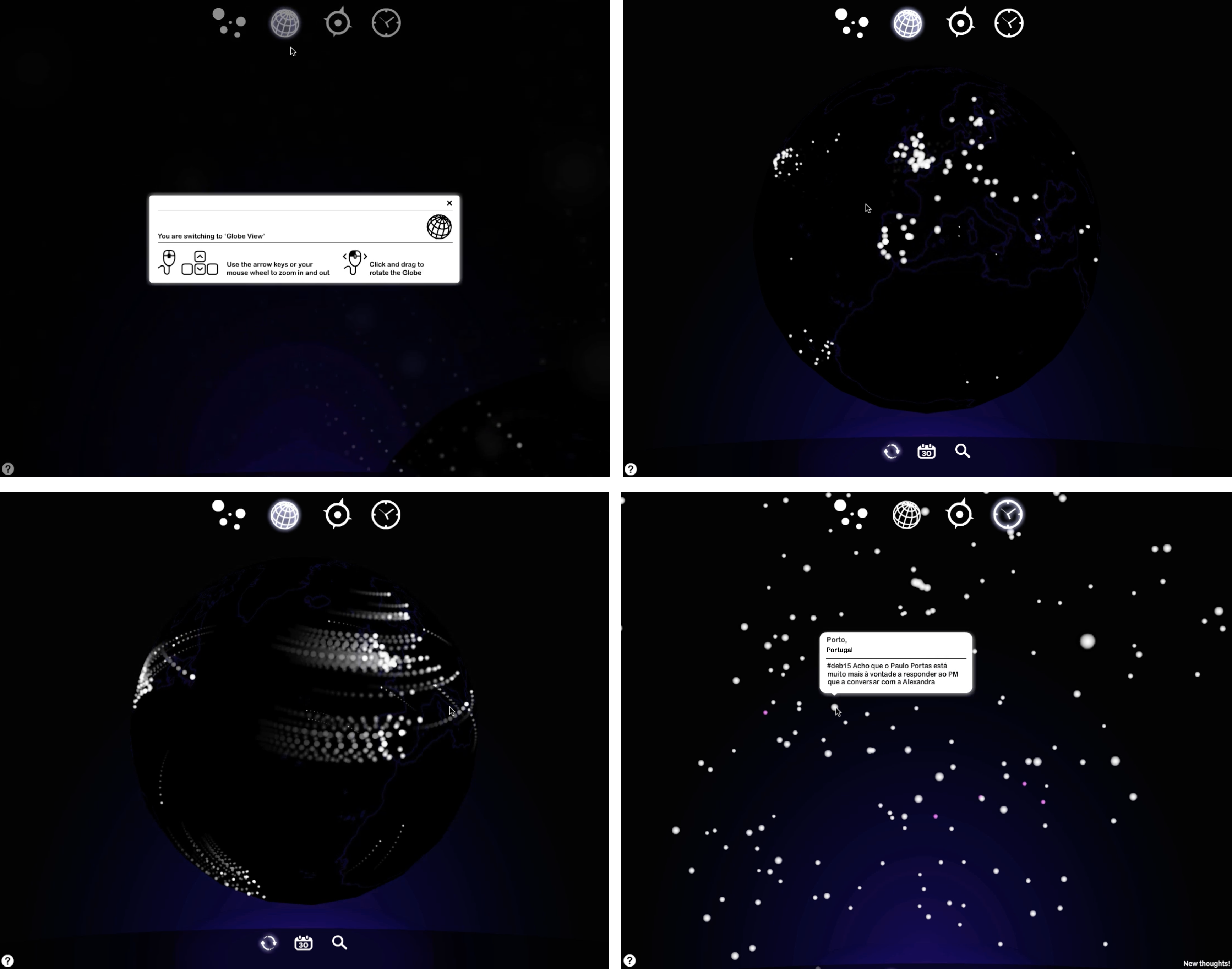
For a broader perspective, the "Globe" view feature presents the world's thoughts on a 3D globe, allowing you to see how ideas and sentiments spread across the planet. Alternatively, if you prefer a traditional 2D "Map" this view displays these thoughts on a 2D plane
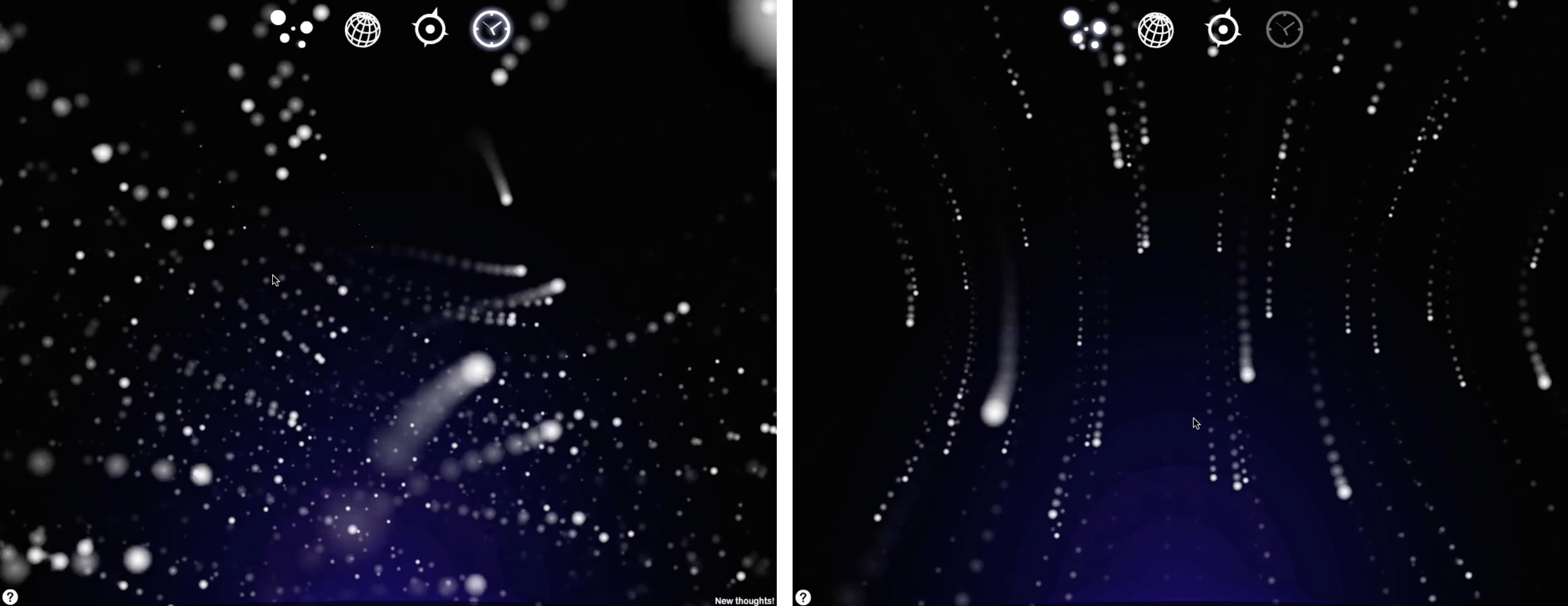
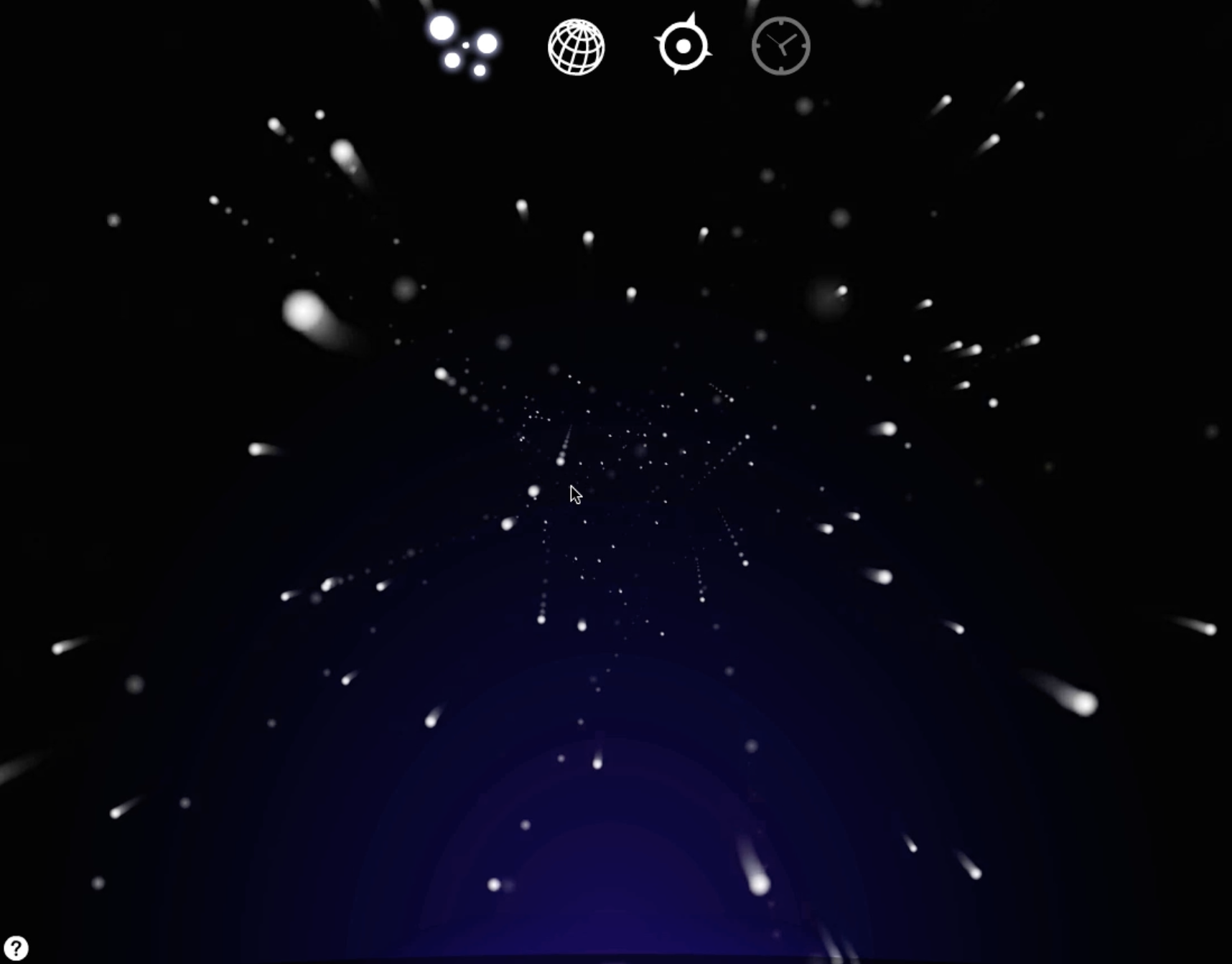
The "Time Tunnel" view feature, allows you to travel through time, uncovering what people were thinking at specific moments in the past. It's an enlightening journey through the evolution of global thoughts and opinions.

There exists a sublime beauty, one that is vividly captured in how the data points are presented through various views. The concept of 'data being beautiful' transcends mere numbers and charts; it embodies the artistry found in the intricate patterns and narratives that emerge when data is skilfully visualised. Each graph, map, or 3D model serves not just as a portal of information, but as a generative art piece woven from the threads of countless data points, each contributing to a larger, more complex picture.
This mosaic of information is brought to life through the visuals, but also connecting the viewer to the world's consciousness. It transforms raw data into a visual feast, revealing the elegance hidden within numbers and statistics, and inviting viewers to appreciate the harmonious blend of knowledge and artistry.

Users engaged with the app, and their feedback was both fascinating and satisfying, reinforcing the project's ambition to showcase 'Beautiful Data'. Numerous users expressed the elegance of the animations and the presentation style of the data. However, a particularly noteworthy aspect of the feedback was the significant amount of time users spent immersed in the app. They were captivated by the wide range of emotions - from the absurd and sad to the happy and angry - encapsulated in the thoughts it had collected. This deep engagement highlights how effectively the app resonated with users, allowing them to explore a diverse tapestry of of data in a human way.
