A New Visual Identity for Weave + Blend.
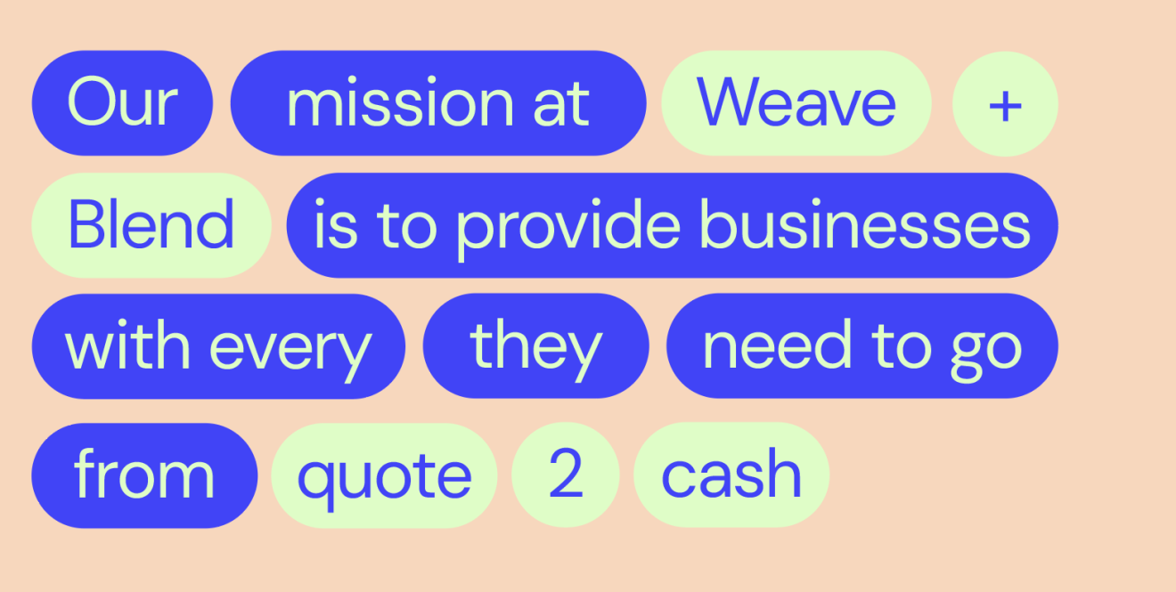
Weave + Blend creates and builds software specifically tailored for HubSpot, focusing on high-quality, sustainable apps that address real-world business challenges. Their mission is to make technology accessible and practical for businesses of all sizes. As part of their growth, developing a refreshed visual identity represents an exciting opportunity to encapsulate their ethos of innovation, usability, and sustainability.
Creative Direction & Thinking.
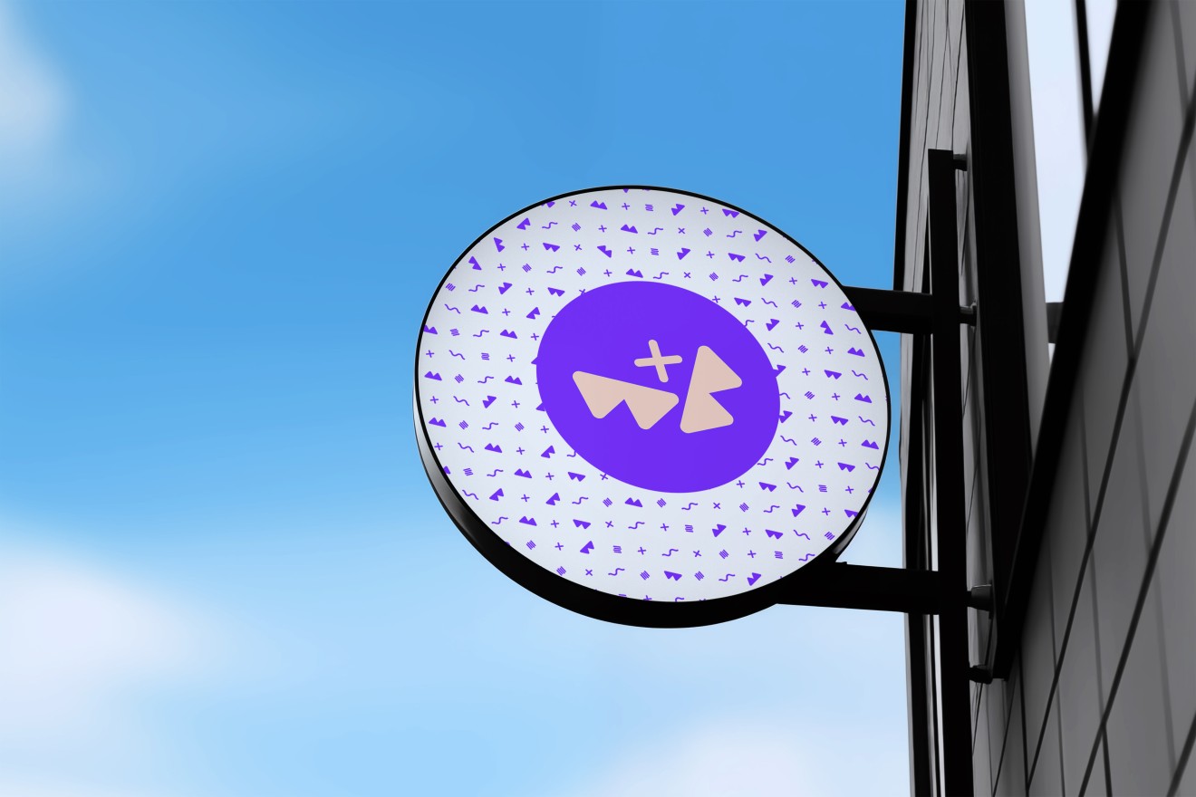
Drawing from their commitment to building apps that are flexible, relevant, and impactful, the new identity combined a fun, friendly and modern aesthetic with the essence of collaboration and functionality. Taking inspiration from the brands name and organic forms and technological precision, the refreshed design could echo patterns and symbols of interconnectedness and limitless potential. These elements align perfectly with Weave + Blend's ethos and ambition to seamlessly integrate with HubSpot, mirroring the dynamic relationship between human creativity and technology.



Margin Construction
To create our margins, we take the longest side of the application and divide by 25. This gives us a modular margin that scales proportionately across all application formats and sizes.
Note: In some extreme cases (very wide or very tall) applications, your margins may need to be adjusted manually for optical correctness.
Margin Formula
Longest side / 25 = Margin
Applying Headlines & Subheads
Headlines are applied to documents relative to the margins, format size, and line length. Use these examples as a reference for setting headlines across various application formats.
Note: The cap-height of headlines touches the top margin. The ascenders are allowed to protrude above it.
Subheadlines are applied relative to the headline. As stated on page 41, subheadlines should be at maximum 50% of the type size of the headline to ensure proper hierarchy.
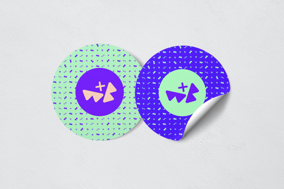
Colour plays an important role in how the identity comes to life. Colour amplifies brand expression and our personality.

The balance of colour is important to maintain a cohesive identity. When using the palette in any context, reference the proportion of colours above. Some colours are not suitable to be used in combination with others. The following diagram demonstrates approved colour combinations.

The visual identity also includes flexible design assets, such as iconography and UI components, ensuring the brand can adapt effortlessly to evolving digital and offline platforms.
Ultimately, the new visual identity reflects Weave + Blend’s unique role in empowering businesses with innovative, software tools, making their solutions as visually compelling as they are effective. This evolution will not only enhances brand recognition but also solidifies their position as a trusted partner within the HubSpot ecosystem.

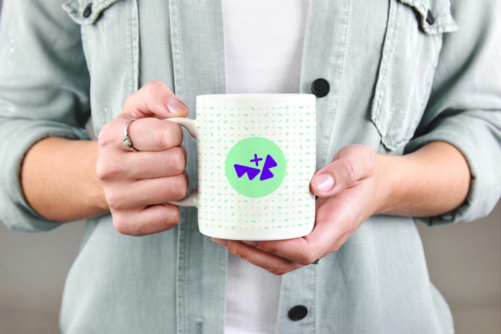


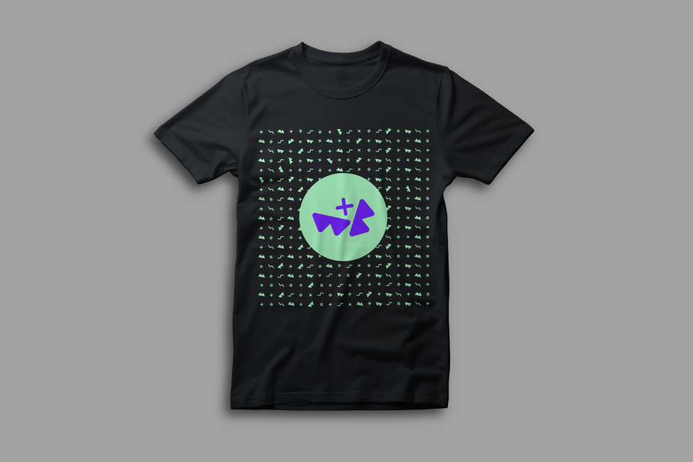
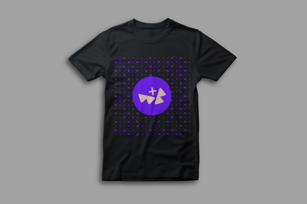

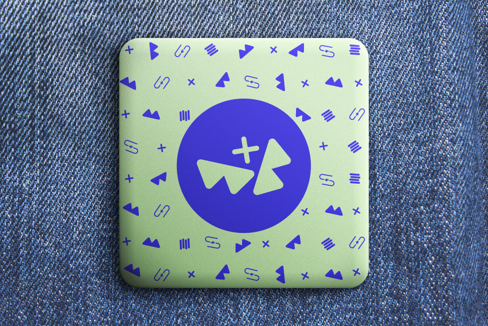
By drawing inspiration from its existing visual language, the new design can enhance recognition while introducing bold, versatile elements that resonate with modern online audiences. A cohesive blend of typography, colour palettes, and graphic elements will embody Weave + Blend's unique narrative, ensuring it stands out within its industry.


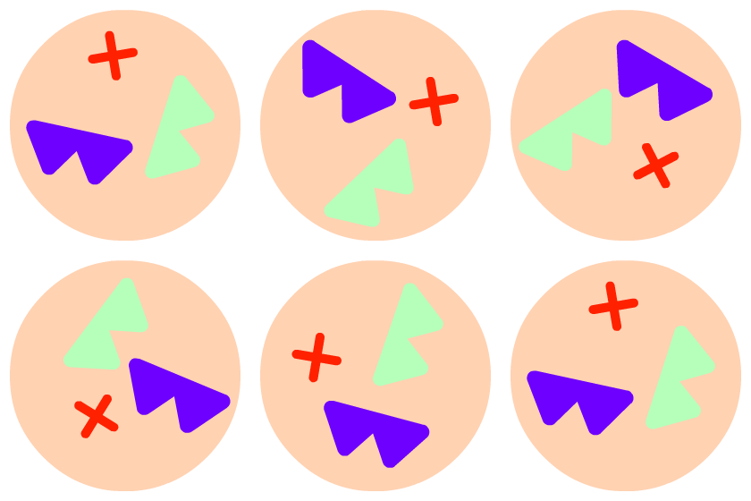
The logo is designed to move within a fixed space. Weaving and blending as it moves the behaviour is random along with the colour change.


Working with Fiora has been a game-changing experience. The passion they have for their craft and the depth of insight really shows through in the work they’ve done. The end result is a versatile identity that not only looks great, but has meaning and purpose behind it.
The whole process felt like a collaborative journey, gave us insights into things we had never even considered before and has really set our business up for growth.
